We’ve finally got the HTC One here at HQ. The preview is already up after our brief run-in with it on its unveiling in New York but we’re still eager to play with it and get down to ultrapixel level, if you know what I mean.

There’s much to like about the One. It’s HTC pulling all the stops and putting it all on the line against competition from Samsung, LG and Sony among others.
It’s HTC’s masterpiece in a sense – the body is redesigned, the Sense UI has gotten an almost complete overhaul and there are a few innovative bells and whistles here and there, designed to elevate the HTC One above the competition.
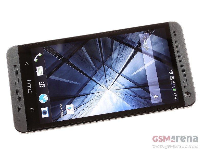
Built from high-grade aluminum and nestled into a gapless unibody, the HTC One oozes quality. The screen is the centerpiece and HTC has interestingly gone with a smaller footprint – instead of the 5″ benchmark we’re seeing with more and more flagships these days, the HTC One sports a 4.7″ diagonal of 1920 x 1080 resolution. The result is a mind-boggling pixel density of 469 pixels per inch, which ensures that everything from text through webpages to videos is perfectly crisp and clear.
The technology behind the display is Super LCD3, which we already saw on the Butterfly and DROID DNA. It’s excellent and HTC has even found a way to improve color saturation slightly. It’s easily the best screen on a smartphone bar none (considering quality and size).
There are two stereo loudspeakers above and under the display, each with its own amplifier. We like the dual speaker setup as watching movies and playing games on the HTC One will surely benefit from the extra oomph. As for the sound itself – while it’s not the loudest we’ve ever heard, it is of great quality and respectable loudness.
Sense 5 is working hard to distinguish itself from other proprietary Android OS’s. The lockscreen has been revamped (though function remains untouched for the most part), then you get to BlinkFeed, which is the default pane in the Sense layout.
It acts as a Flipboard-like news delivery system with a fluid scrollable interface and a huge number of sources from which to choose from. After you’ve preset the sources you want, you’re left with a beautiful information punch that will quickly get you up to speed on your interests.
Then there’s the ultrapixel camera everybody’s buzzing about. We’ve had time to play around with it and have a quick comparison with the Xperia Z.
Now its time to get down to business – reviewing business, that is, which is what we do best.


No comments:
Post a Comment